


We have updated our Component structure, to enable you to easily define its dependencies. This means you are now able to create (and use) Components with dependencies, without having to work with a manual component dependency bundle inside your application. Next to this you now can share and re-use these components via the Block Store, for other builders to use them seamlessly as well.
How can I add the new dependency structure to a component?
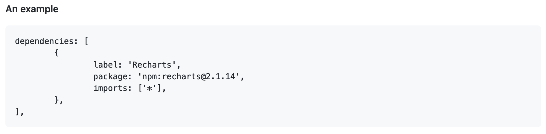
In this Github documentation you can find in detail how the components (and its dependencies) need to be defined. When the dependencies are defined in this new format it means the bundle doesn't need to be managed manually. The current components (with the old structure) will keep working as expected, but this means you will need to keep working with the manual bundle for applications where they are used. We recommend rewriting your components to the new structure, in order to fully benefit from the new feature. The manual bundle and the automatically generated bundle are able to work together inside an application.
How is the application bundle created and updated?
We (as Betty Blocks) now automatically create and manage your application bundle. These are the scenarios where this applies:
Design time
When you drop a component on the canvas we will check if the component has a dependency which is not (yet) part of the bundle. When this is the case you will see a loading screen, while we update the bundle (to add the new dependency). When you drop a component without a dependency or a component with a dependency that is already present in the bundle the existing flow will not change.
Runtime
When you compile the application (press play) we will generate a bundle with only all components used on pages inside the application. This means you will always get an optimized bundle, only containing dependencies that are actually needed. Be aware that compiling applications might take (a bit) longer than before, because we need to do a bit more work to give you the best runtime experience.
Other scenarios
When you merge, rollback or rebase an application we will also create a bundle based on the current needs of the application.
How can I use this feature via the Block Store?
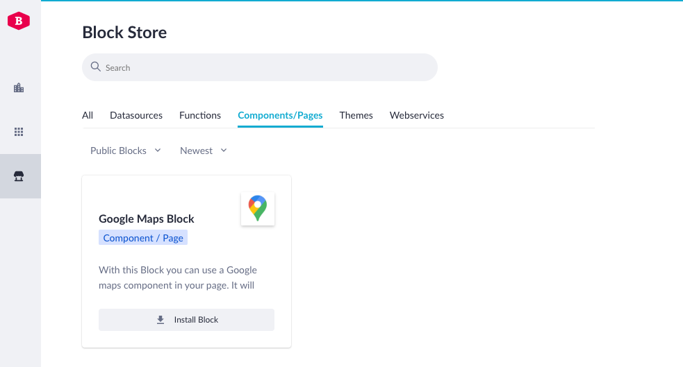
Components are already part of the Block Store (documentation), and self-developed ones can already be re-used by other builders. The main missing feature always was the ability to easily use components containing external dependencies. This is no longer the case, because of all the bundle generation we now do (as described above). This means other builders can now install and drag Block Store components on the canvas, while we automatically keep the bundle up to date.
⚠️Good to know: all shared Block store components always used to be visible automatically inside the IDE palette of applications. This is no longer the case, as you are then required to actually install Block Store components for them to become visible in application(s). This means you will only see what you have installed, keeping the IDE palette clean. This is how the Components Blocks will behave in the IDE;
| Block status/type | Visibility in IDE palette |
| Publicly available Blocks | Only after installation for the specific app |
| Blocks shared with certain organization(s) | Only after installation for the specific app |
| Blocks created in a specific app (but not added to Block Store) |
Always only visible in the app where its created in (for all builders) |
| Blocks where I am owner of | Always visible in all applications for all owners |
Now available: Rich Text Editor Component
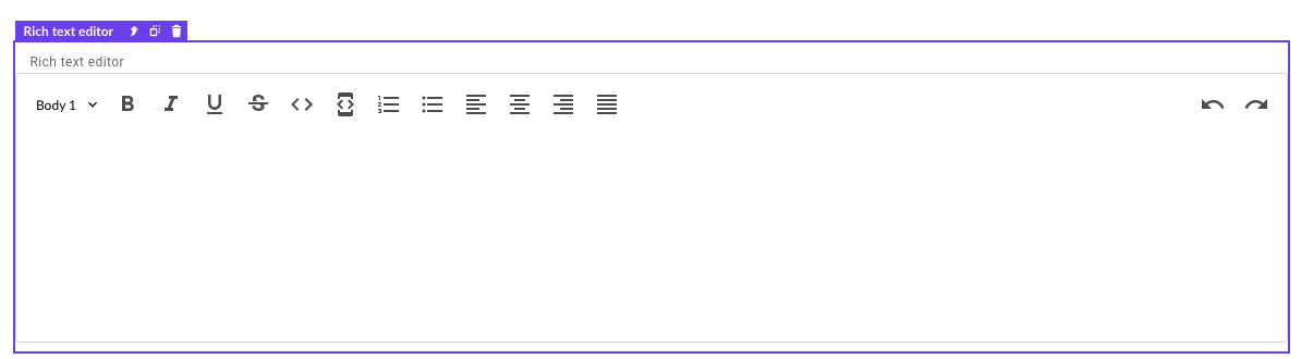
The first component to use this feature is the Rich Text Editor component. It is a standard component available in our default component set, but it has an external dependency to make it function. After you drag the component on the canvas it will add the dependency to your application. The Rich Text Editor comes with all standard features such as headings, bold, underline, and cursive for your text. Also, it features text alignment and lists, so you can position your text in any way you'd like. Also, you will have an undo/redo function inside the rich text editor.
This component needs a rich text property in your data model to be able to save data to it. Saving your data works just like any other input component currently in the set, so you don't need to do anything special to use it.
This was all for now. Your feedback allows us to continuously improve the Product. So please, let us know what you think!