


With one of the latest releases of the Betty Blocks Platform, you can now Reconfigure existing components on the canvas of the Page Builder. This new feature makes changing existing components much easier to approach for citizen developers. You can think of adding columns to data tables or changing list items in lists as example use-cases.
To deliver this value, we have extended our Page Builder framework to ensure that not only the Betty Blocks default component set can have this feature enabled, but that component developers are also able to apply the Reconfigure option to self-developed UI components. This makes this increment multi use-case ready and it can be adopted quite easily by Customers and Partners developing their own No-code toolkit with UI components.
What it consists of
When a component with this feature is added, it comes with two new options in the sidebar (see the full list of components in one of the sections below):
- Reconfigure option
- Add 'Child' option
Reconfigure option
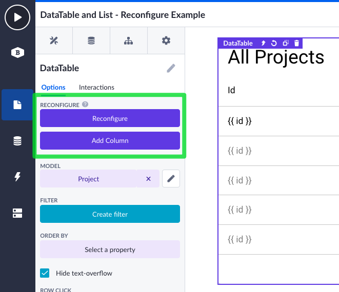
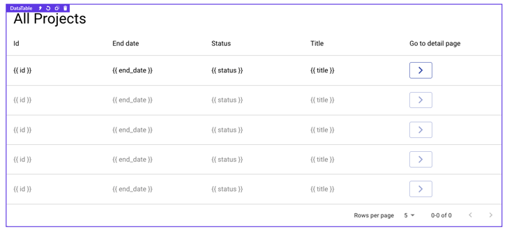
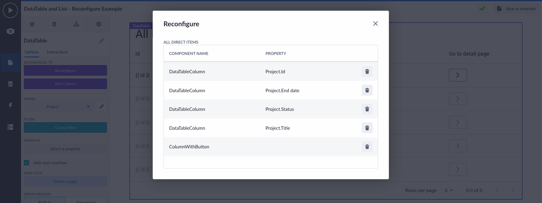
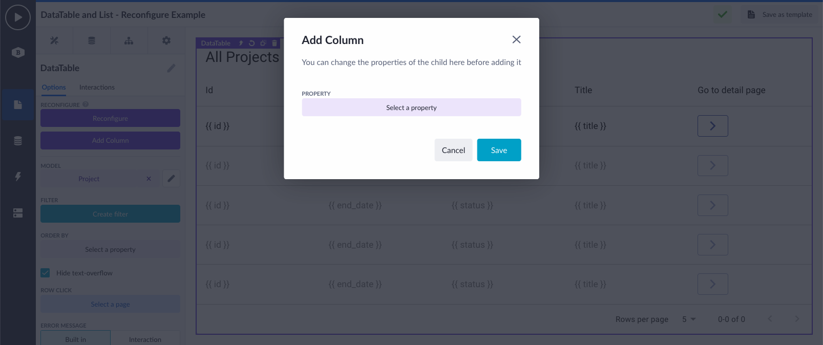
The Reconfigure option shows an overview of 'all direct children' available inside of an existing component on the canvas. In this example, we have a data table with five columns. These five columns are the direct children of the data table.
When clicking on the Reconfigure option, the direct children overview is shown. This overview consists of a table with the following attributes as columns:
- Component name
- Other options, defined by the component developer
Regardless of which component you open the Reconfigure from, the overview always shows the component name as the first attribute. This is the name the component also has on the canvas. The rest of the attributes shown are configurable by the component developer(s) themselves. For the data table that Betty Blocks offers in its no-code toolkit, the property option is shown second.
The purpose of this overview is to do simple CRUD operations. Instead of knowing your entire way out in the Page Builder's sidebar, which components to click on and what options to select, this Reconfigure option is more straightforward in terms of UX. For the data table this means:
- Create new columns to the data table
- Read the available columns present already
- Update:
- The ordering of columns (the indexing).
- Options of an existing column.
- Delete columns from the data table.
Currently, the scope of this overview only consists of the read and delete parts with updating on its way soon, as well as the creation of a new child from this overview. However, creating a new child (new column to the data table) is already available as singular option in the component sidebar.
Add Child option
The Add Child option is meant to create a new child - as component - inside of an already existing component on the canvas. In our example we took the data table. The direct child structure of a data table are its columns. And that is exactly what you are able to add when using this option. The component developer of the data table has defined how the child structure looks like - so what actually will be created when adding a new column. For whatever reason, it could be possible that the component developer has decided that there are other components nested inside the column as well (think of Boxes, Buttons, whatsoever). This is all possible.
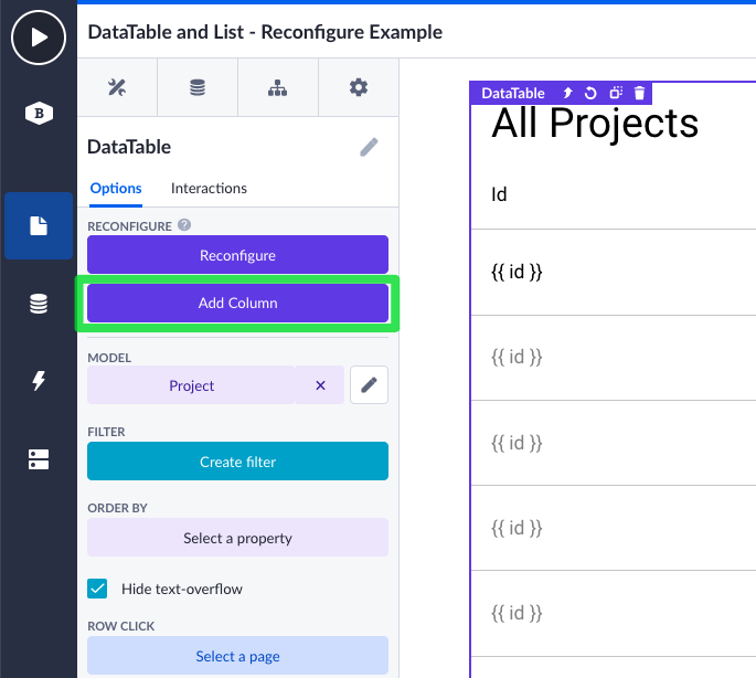
When clicking on the Add Child option, a popup appears that shows one or many options. What options are shown, is defined by the component developer. In this case, for the data table columns, the Add Child popup only contains of the property option. This means that you can add a column and specify which property to render its value. Leaving this empty, means you are creating just an empty column.
Using these new features inside the scope of Wrappers
Because the Reconfigure and Add Child features are just component options, similar to other component options, they can also be pushed to (Page) Wrappers.
I hear you thinking: What is a Wrapper? In a nutshell: It is a layer around a group of components. It can have linked/pushed options, to show in the sidebar. The group of components can be 'wrapped' to only one clickable component on the canvas. Which makes the (re)configuration of it way easier for citizen developers.
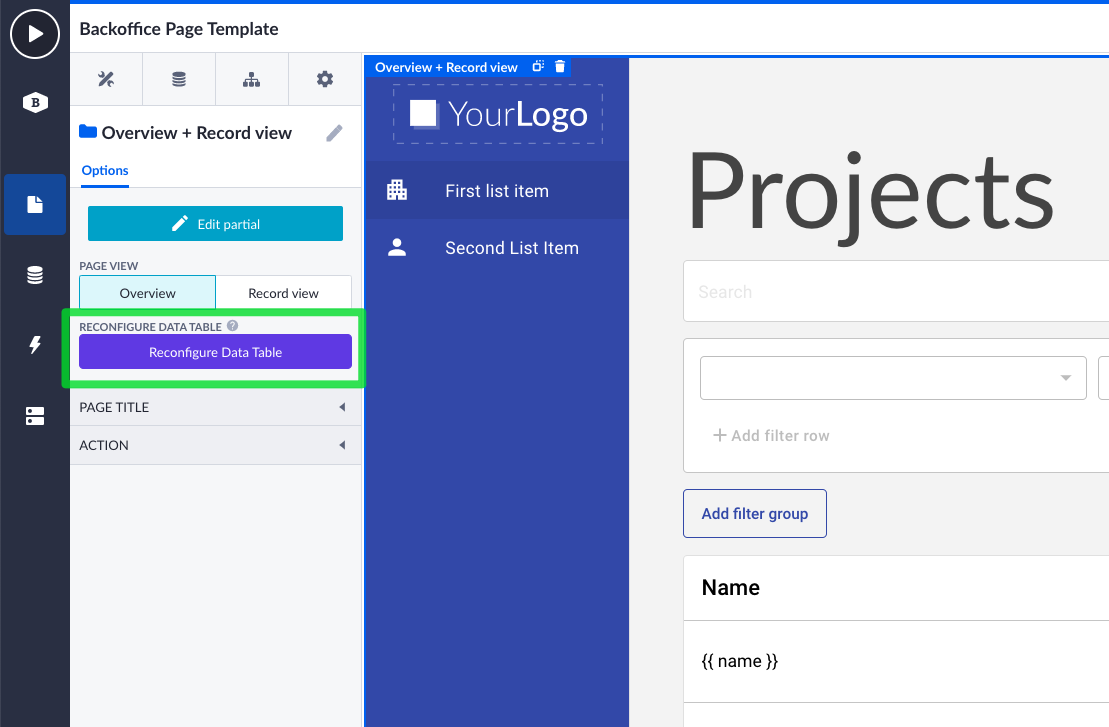
In the example below, we have the Backoffice Page template. The components where this page consists of are all wrapped in one Page Wrapper. Inside this group of components there is a data table available.
Imagine, you want to change this? You want to add an extra column or change the ordering of the available columns. Instead of opening the Wrapper, you can now just use the pushed Reconfigure and Add Child options on the Page Wrapper itself. Meaning that your citizen developers do not necessarily have to open the Wrapper to dive into the page details to do simple changes to it.
Components in the BB default no-code toolkit to which this is added
The new Reconfigure and Add Child options are added to following list of UI components that live inside the Betty Blocks default no-code toolkit:
- Datatable
- List
- Menu
- Breadcrumb
- Stepper
- Tabs
- Subview
Using these new features as component developer
As said earlier, the Reconfigure and Add Child features can be adopted by Customers or Partners who are developing their own UI component set on the Betty Block Platform. We've updated our component development documentation with a new section called Reconfigure. You can find it here.
That was all for now, your feedback allows us to continuously improve our product. Please, let us know what you think about it. Happy building! 😃
