


With the latest releases of the Betty Blocks Platform you can now add and install your own typography fonts to your application's theme. This new feature, aims to give you more flexibility and enhanced customization when it comes to matching your application's look-and-feel with your brand's visual identity.
Adding new fonts in the Theme Builder
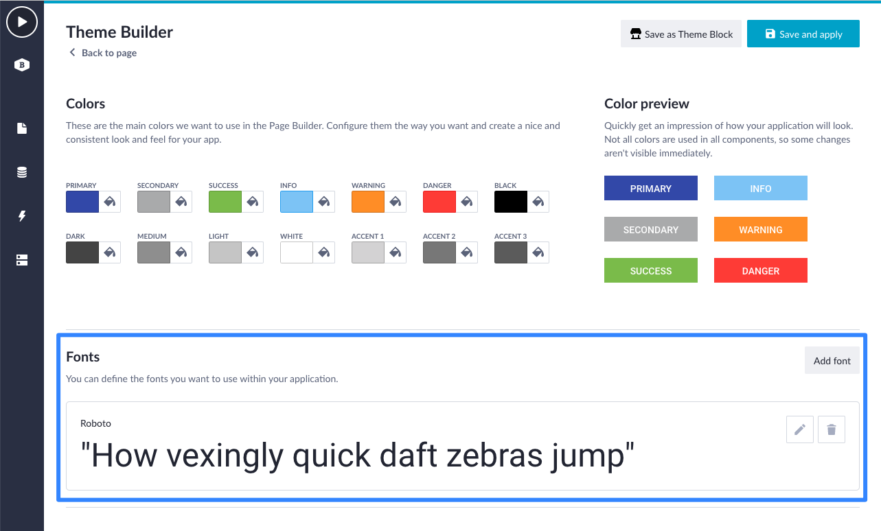
If you open the Theme Builder in the development environment (IDE) of your application, you will now see a new "Fonts" section below colours. This is where your application fonts are listed with an overview of the fonts available inside this application. Each font in the list is previewed with the holoalphabetic sentence (a sentence using every letter of the alphabet).
By clicking the "Add font" button you'll be able to add a new font. Every Betty Blocks application has the default Roboto font. This default font cannot be altered or deleted (yet).
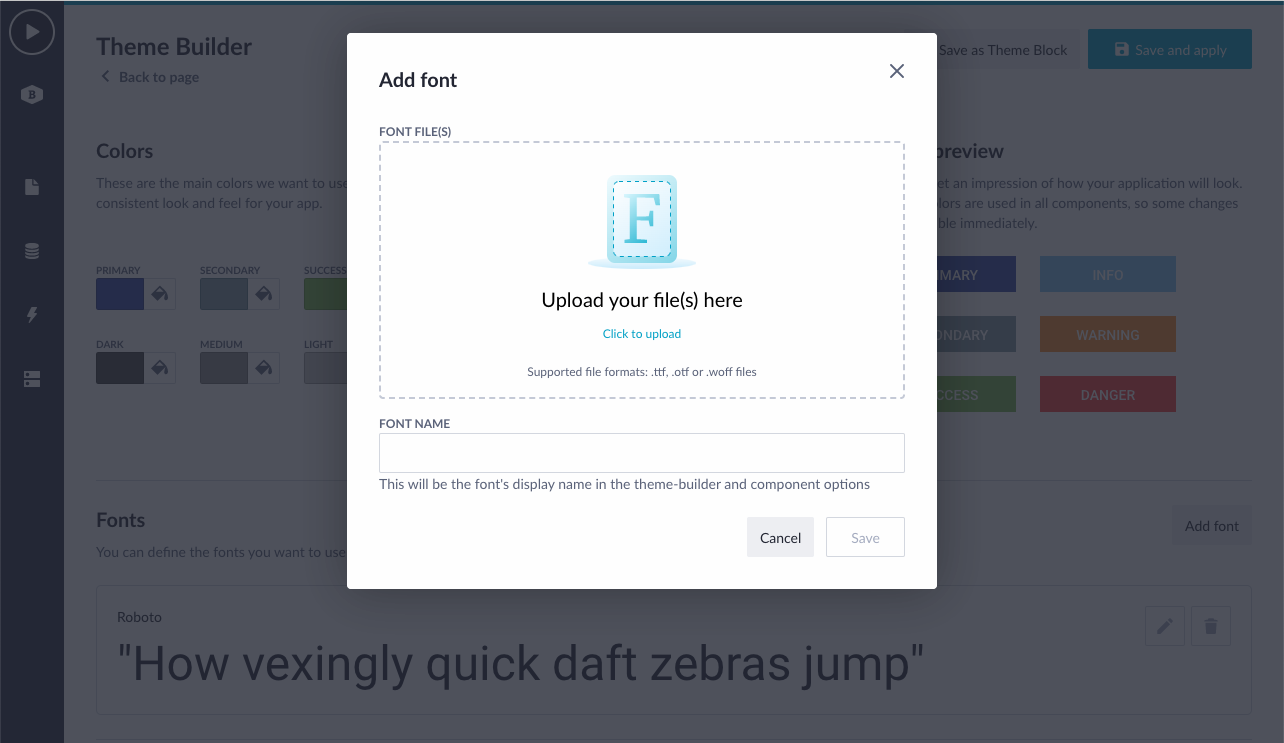
When adding a new font, a modal is opened to upload the required font files. You can upload multiple files at once. At this moment, the following font file formats are supported:
- ttf,
- otf,
- and woff
There are multiple converter tools online to covert the files to these formats. You are allowed to add a maximum of five fonts per application and in each font you can upload a maximum of ten different font files.
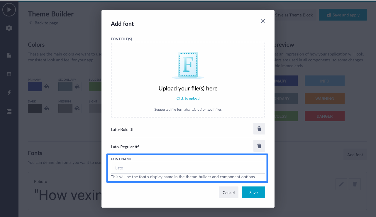
After you've upload your font file(s), the font family name is automatically extracted from the files. This name will be the font's display name in the Theme Builder and also in the Page Builder component options.
The upload font will check whether you have added font files of the same family. Obviously you cannot mix different font families in one font.
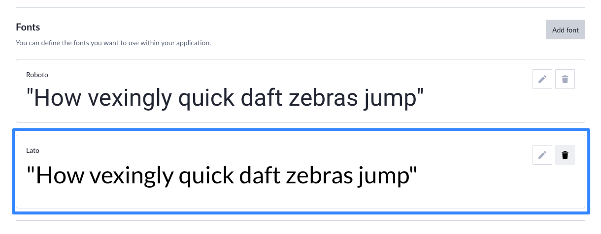
After you have successfully added the font, it will be rendered in the fonts overview and you are ready to use it in component styling.
*Using google fonts? Within the current scope of the feature, you'll have to download the font and add it to your application. In the future, we will enhance the flow of using google fonts without uploading.
Using the newly added font in component styling
After you've added the font, you can use it in component styling. This is done via the typography styles in the Theme Builder and via the component options. By doing this, you'll see that the font is used while designing your page as well as while running the application live.
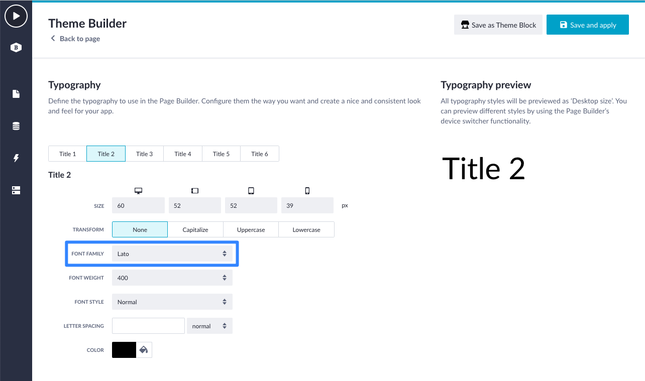
In the example below, I have updated the Title 2 typography style from Roboto to the newly added Lato font.
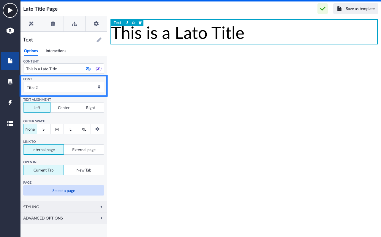
Within the Page Builder, I have used the updated style Title 2 in the Title component. The font of the title in designtime is update to Lato.
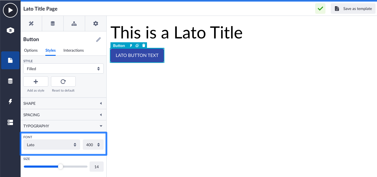
I have done the same for the button style. Only at buttons, we have the styles tab available which isn't fully rolled-out to other components yet. Here I have updated the font to Lato as well and saved the style. As a result, that the button text in designtime has updated.
Scope update
The story above explains the current scope of the feature available now. In the near future we will update the feature with the following abilities:
- Ability to update font files after a font is added. Edit button is now disabled.
- Reusable themes with fonts via the Block Store. They are currently not part of theme blocks yet.
- Ability to delete a font and replace it with another available font in one-go, so that all references in components will be updated as well.
- Font preview selector in the fonts overview, to preview the different font files.
If you want to know more about the functioning of this feature, please check out the documentation page for more information.
That was all for now, your feedback allows us to continuously improve our product. Please, let us know what you think about it. Happy building! 😃
